1. Open Microsoft
Excel. ![]()
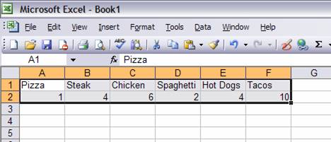
2. In row 1 type in the choices that you gave people for your survey.
![]()
![]()
![]()
![]()
![]()
![]()
![]()
![]()
![]()
![]()
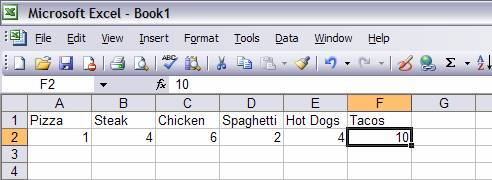 3.
In row 2 type in the number of students that
picked each choice under the specific choice.
3.
In row 2 type in the number of students that
picked each choice under the specific choice.
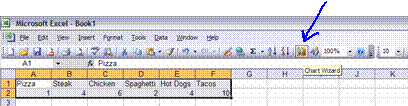
4. Click and drag to highlight all of the boxes with your data.
5. Now click on the chart wizard button.
![]()
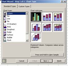 6.
You may choose a column or line graph and then click “Next.”
6.
You may choose a column or line graph and then click “Next.”
![]()
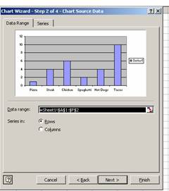 7.
Preview your chart and click “Next.”
7.
Preview your chart and click “Next.”
![]()
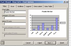 8.
Type in a chart title and click “Next.”
8.
Type in a chart title and click “Next.”
![]()
![]()
![]()
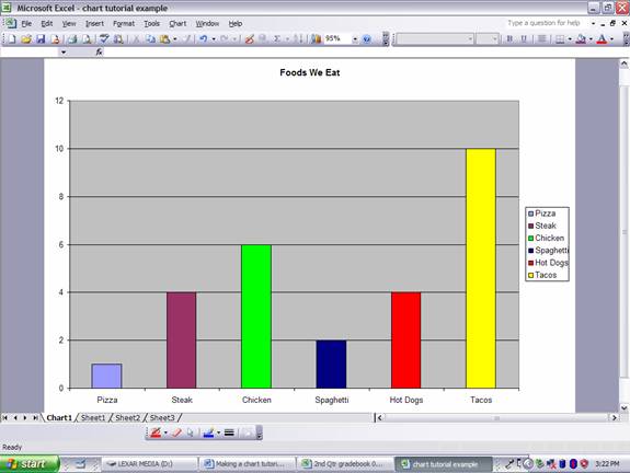
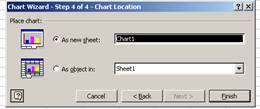 9.
Select “As new sheet” and click “Finish.”
9.
Select “As new sheet” and click “Finish.”
CHANGING THE COLORS
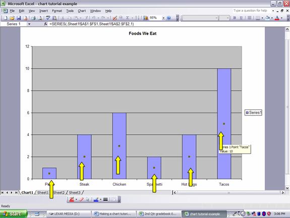
1. Click once on one of the bars in your graph. You should see a gray square appear in each bar.
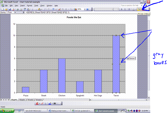
2. Now click once more on one of the bars. You should see gray boxes around the outside of that bar. Then click on the arrow next to the “Fill Color” button and choose a color.
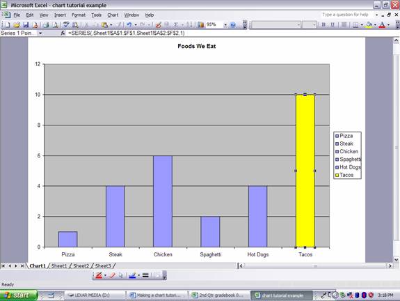
3. Repeat step #2 for each category, choosing a different color for each.